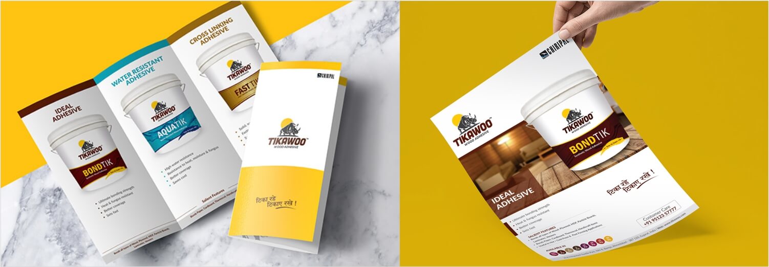
Branding a new product with competition from the national players.
(in assoc. with Whitesand Design)
Positioning
Brand name
Brand Identity
Packaging
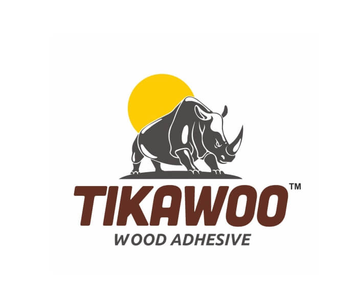
The brand name ‘Tikawoo (tikau) is derived from the hindi language which means - long lasting. The ‘double o’ was a deliberate attempt to give an international brand appeal.
The rhino was chosen for solitude, strength and steadiness. Name and symbol both give a strong long-lasting association.
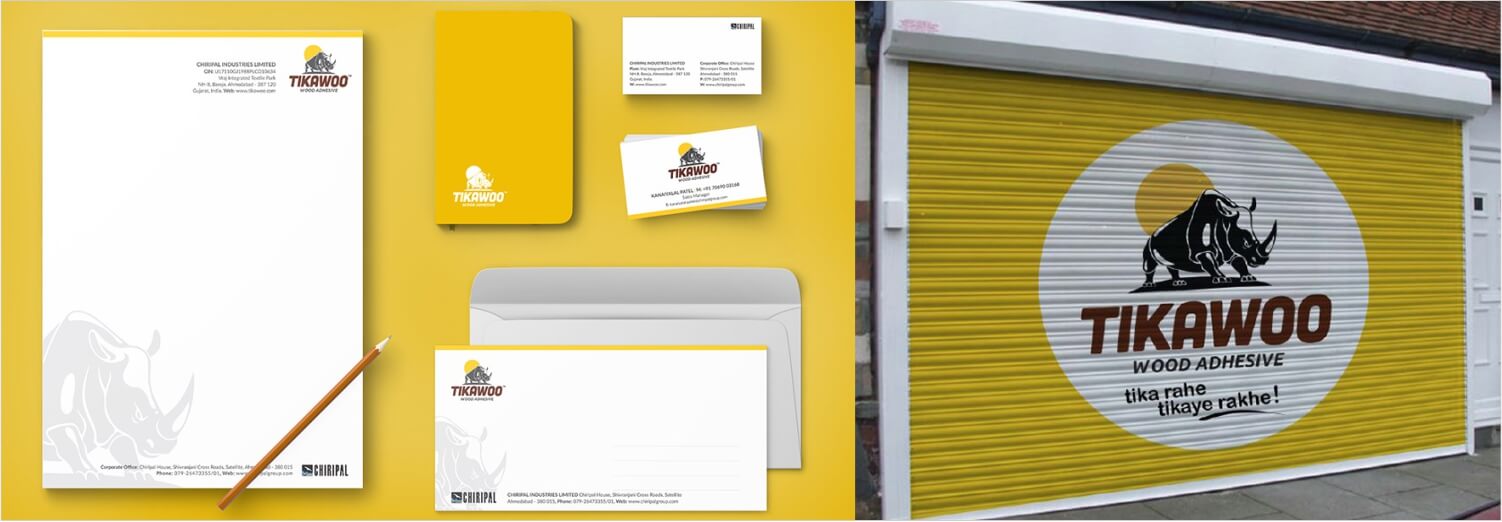
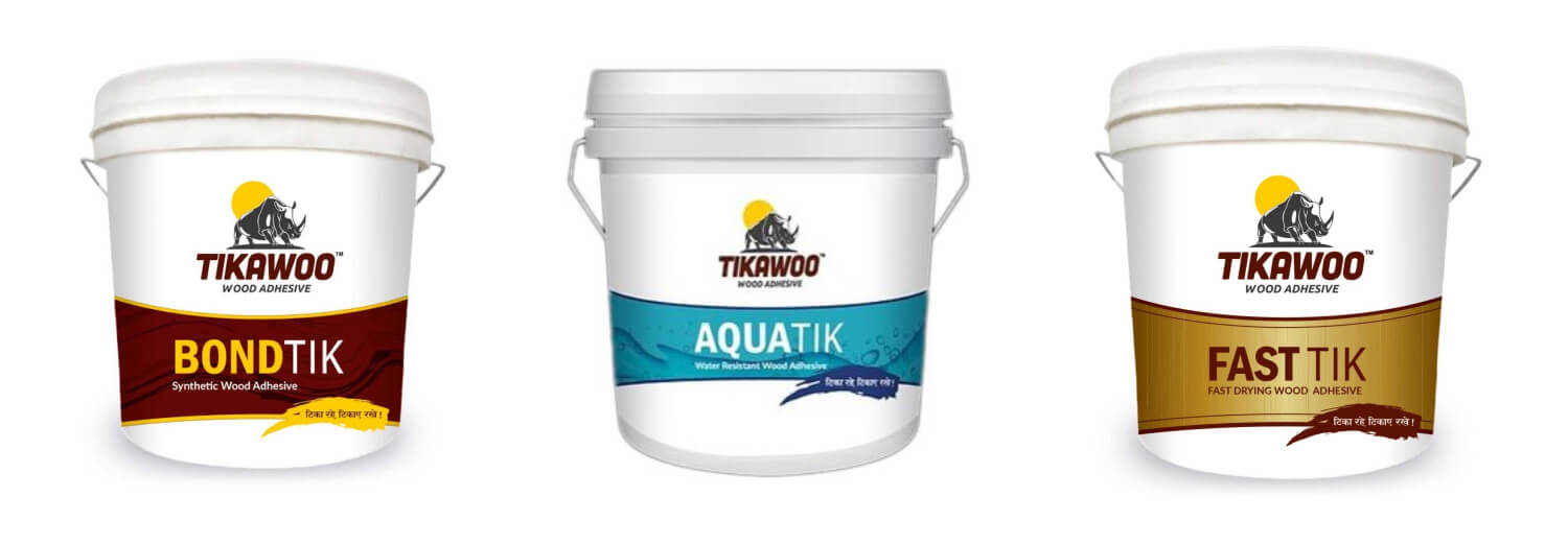
The primary target audience being well educated interior designers and architects and secondary target audience being carpenters, it became important to strike a balance between the international perception of a brand and local flavour so as to appeal to both the audiences.
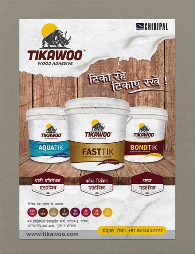
To make sure the design approach did not fall out from the above strategy, the brand identity was developed for an international brand perception. To incorporate the local flavour a hindi brand name which meant ‘long lasting’ was derived. The packaging was given a neat clean look yet differentiated from its competition. Again for the local flavour, a hindi tagline was coined: tika rahein, tikaae rakhein.
